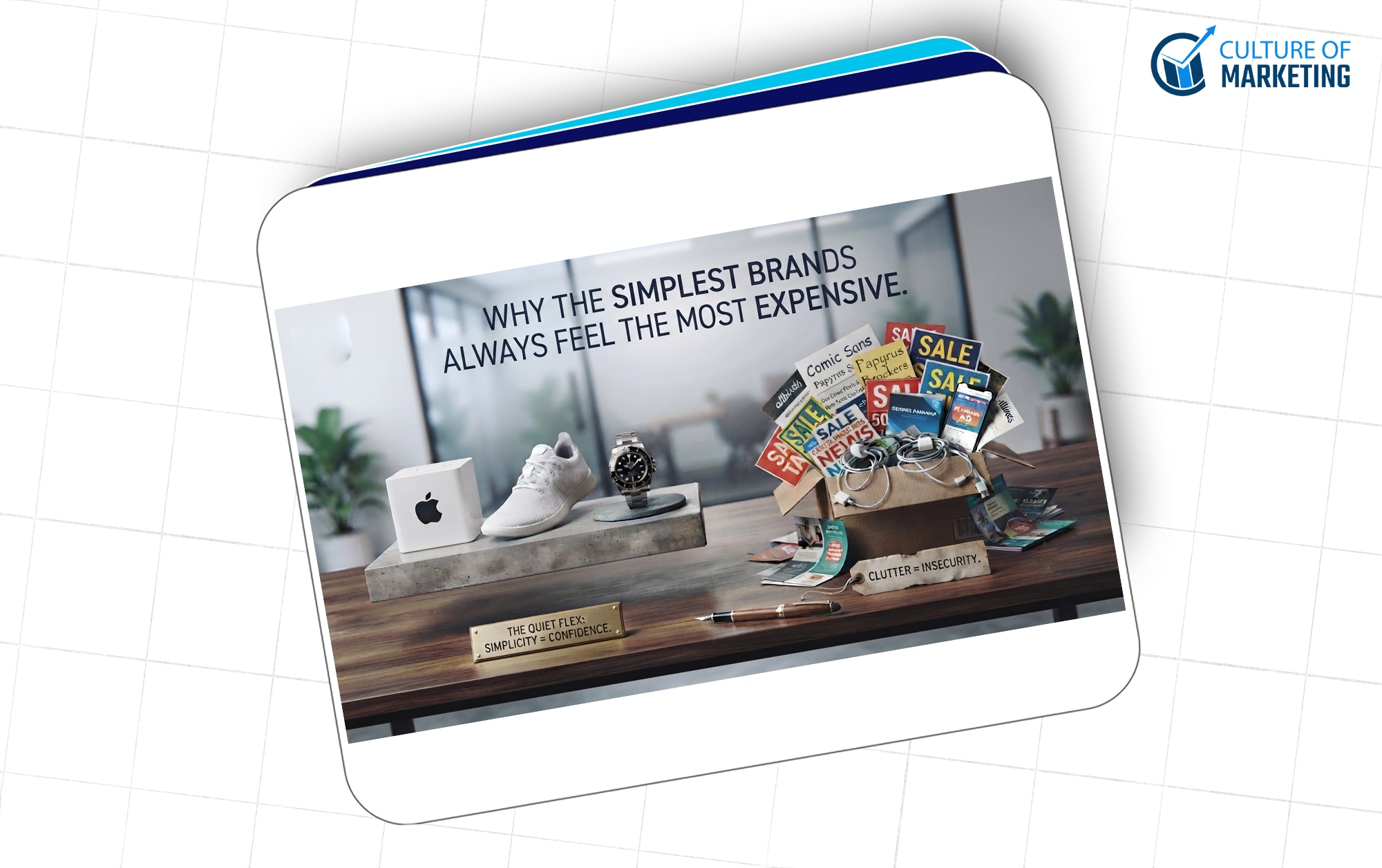
Why the Simplest Brands Always Feel the Most Expensive
Walk into any Apple store and pay attention to your first reaction, not to the products, to the space itself. There's almost nothing there. Bare tables. White walls. Employees who aren't chasing you down the aisle. And somehow, all of that emptiness makes you feel like you walked into somewhere that matters.
Now, recall the last store you walked into where every window had a sale sign, three different fonts were fighting on the same poster, and a TV was blaring in the background. Same industry. A completely different feeling.
That gap — that psychological difference between "this feels cheap" and "this feels expensive" — is not about budget. It's not about the product. It's about a choice one brand made that the other one didn't.
That choice is simplicity. And even in 2025, most brands still underestimate how much it's actually doing.
Nobody Can Absorb Everything You're Throwing at Them
Let's start with the context problem. The average American runs into somewhere between 4,000 and 10,000 brand messages every single day. Before you've finished your morning coffee, you've already been exposed to dozens — your phone screen, a podcast ad, a sponsored Instagram post, the logo on the coffee sleeve, the brand name on your headphones.
Your brain isn't built to absorb all of that. So don't try. It quietly filters out the majority of it before you even register it consciously.
What this means for brands is uncomfortable but important: the instinct to say more, show more, and be louder is working against you. In a saturated environment, noise reads as noise — no matter how much money you spent producing it.
The brand that shows up with one clean idea, one clear visual, and one confident message doesn't just cut through. It feels different in a way that actually gets remembered.
Psychologists call this the Von Restorff Effect — the brain naturally holds onto things that stand out from their surroundings. In a world where every brand is at maximum volume, restraint is the thing that's actually unusual. Restraint is what gets noticed.
"Premium" Is a Feeling, Not Just a Feature List
Here's something that makes a lot of people in marketing uncomfortable: a huge part of what we call "premium" is built on perception, not product specs.
When you see a wine bottle with a clean matte label and minimal typography, you assume it's good before you taste it. When a skincare brand ships in plain white packaging with small, confident text, you assume the formula inside is serious. When a fashion brand's website has barely anything on it — no pop-ups, no countdown banners, just clean imagery and white space — you assume the price is probably justified.
None of those assumptions is based on evidence. It's based on signals.
And simplicity is one of the most powerful signals a brand can send — because of what it quietly communicates without saying a word:
We're confident. We don't need ten claims to convince you.
We're clear on who we are. We're not trying to appeal to everyone.
We trust the product. It doesn't need decoration to be worth it.
That confidence — projected through what a brand chooses not to say — is what makes people feel like they're buying into something, not just buying something.
The Most Successful Brands Say Less Than You Think
Spend some time actually studying brands that have stayed premium for decades, and a pattern becomes clear: they are almost brutally restrained in what they choose to communicate.
Rolex doesn't run ads about movement accuracy or water resistance ratings. They show you a wrist. Maybe a mountain. They're not selling a watch — they're selling the person you become when you wear one.
Nike doesn't explain the engineering in the sole or list marathon performance data. They show someone pushing through a brutal run at 5 am, and they say three words. Three. That's it. And it lands harder than any product breakdown ever could.
Apple doesn't publish a paragraph explaining why its design philosophy matters. They just execute it, consistently, across every surface — the packaging, the store, the product, the website.
What these brands figured out is that trying to say everything signals that you're not sure any single thing is enough. Messaging stuffed with features and qualifiers reads as insecurity. It sounds like a brand that needs your approval.
Simplicity says the opposite. It says: we already know this is good. Now it's your call.
There's a Brain Science Reason This Works
Consumer psychologists have a term for this — processing fluency. The concept is straightforward: the easier something is to understand, the more positively we feel about it.
When a brand is visually clear and verbally simple, your brain doesn't have to work. And that ease gets unconsciously associated with quality, trustworthiness, and competence. The brand didn't just communicate well — it made you feel good in the process of understanding it.
The reverse is equally true. When there's too much competing for attention, when the copy is dense, when the logo feels cluttered — your brain reads that friction as a soft warning sign. Nothing dramatic, just a vague sense that something's off.
This is why the most iconic logos are also the simplest:
Nike's swoosh — no text needed
Apple's apple — instantly recognized in any context
Target's bullseye — one shape, one color, done
None of them is trying to be clever. They're trying to be clear. And that clarity is exactly what makes them stick.
It's the same reason the best taglines are short. "Just Do It." "Think Different." "Because You're Worth It." None of these explains anything. They're feeling something — and the brain rewards them for the ease.
Exclusivity Is Built by Leaving Gaps
Here's a truth that luxury brands have always understood and mass-market brands keep having to relearn: the more you explain yourself, the less desirable you become.
When a brand is running promos constantly, dropping discount codes every other week, and expanding the product line to catch every possible customer, they think they're growing. What they're actually doing is training people to wait for the sale and removing the sense of aspiration that made the brand worth wanting in the first place.
Minimal brands do something different. They create a gap between the customer and the brand — on purpose. Their stores feel like galleries, not retail. Their websites feel like invitations, not catalogs. Their marketing doesn't feel like advertising. It feels like a look inside a world you're deciding if you belong to.
That gap is what makes the purchase feel like something. Not just "I got a product," but "I got access." That feeling is built almost entirely through restraint.
Simple Brands Age Better — and That's Not a Small Thing
One more argument for simplicity that doesn't get nearly enough airtime: trend-driven design expires fast.
Brands that leaned into the gradient era of 2015 look dated. Brands that went all-in on the flat design wave from a few years back look forgettable. Every time a brand chases what's visually contemporary, they're essentially betting that trend won't move — and it always moves.
Meanwhile:
Coca-Cola's script has barely changed in decades
The New York Times masthead is essentially what it's always been
Levi's red tab — still the same
These brands didn't stay consistent because they were being lazy. They stayed consistent because simplicity doesn't have an expiration date, the way trends do. When your identity is built on clean, considered choices instead of what's popular in design circles right now, it becomes an asset that compounds. Customers recognize it faster. It doesn't need an overhaul every three years because it was never tied to what was fashionable to begin with.
That longevity has real financial value. Ask any brand that's had to rebrand twice in five years.
How to Actually Start Applying This
This only matters if it translates into something you can do. So here's where to actually begin:
Look at your colors first. Most cluttered brands aren't cluttered because of their copy — they're cluttered because there's no visual hierarchy and too many colors competing. Stick to two or three. One dominant, one supporting, one accent used rarely. If you're over that, something needs to go.
Read your homepage out loud, slowly. If you run out of breath before finishing a section, it's too long. The real question isn't "what do we want people to know?" It's "what's the one thing we need them to feel?" Everything else is probably working against that.
Notice where you're afraid to cut. The places a brand refuses to simplify are almost always the places where confidence is lowest. An endless feature list usually means the brand isn't sure the core value proposition is strong enough on its own. Simplicity forces that reckoning — which is why it's uncomfortable and why it works. Many startups make the opposite mistake by adding more products, features, and marketing instead of sharpening their core value. Our article on (Why Funded Startups Still Fail) explores how complexity often becomes a bigger threat than competition.
Post less, but mean it more. The brands that feel premium on social media are rarely the ones with the highest frequency. They're the ones where every post looks intentional. One piece of content that's genuinely good will always outperform five that are just filling the calendar.
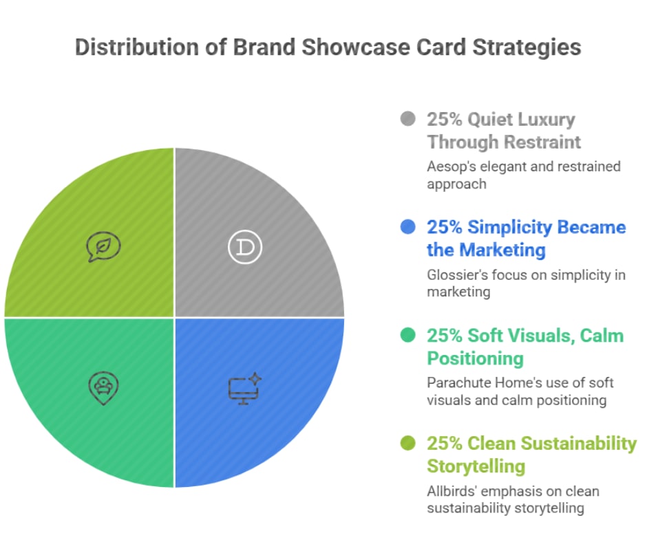
A Few Brands Worth Studying Right Now
If you want to watch this strategy working in real time, these are worth a close look:
Aesop — No celebrity partnerships, minimal store design, packaging that feels more like an apothecary than a beauty brand. Every touchpoint communicates: this is for someone who values quality and doesn't need to be convinced.
Glossier — Built a cult following with a pink bubble mailer and clean product photography. The simplicity was the marketing. For years, they barely ran traditional ads. The restraint did the work.
Parachute Home — Made bedding is aspirational by shooting in natural light, keeping colors neutral, and never overselling. Their brand communicates "considered living" without ever using the phrase.
Allbirds — Simple materials, simple messaging, no visual noise. Sustainable without making it the entire personality.
None of these brands is winning in terms of loudness. They're winning on clarity — and that clarity is a strategic choice, not a budget limitation.
Where This All Lands
Simplicity isn't minimalism for the sake of aesthetics. It isn't a style that works for some brands and not others. It's a strategy rooted in how the human brain actually processes information, assigns value, and builds trust.
The brands that feel expensive almost always feel that way because they made hard choices about what to remove. They resisted the pressure to add more. They found the one true thing about their brand and built everything around that — and then had the discipline to stop there.
If your brand is working overtime to be taken seriously, the answer probably isn't to do more. It's to strip back until what's left is actually worth paying attention to.
In most cases, that thing already exists. It's just buried under everything you were afraid to cut.